
.png)
AI Marketing Tool
Team
Manvita Boyini
Timeline
4 Months
Scope
Product Design
UI Design
Overview
How can creators ideate, create, and preview social posts in one place instead of switching between tools?
Content creation for social media is inherently fragmented. Creators typically move across multiple disconnected tools to ideate, generate assets, write, and format content for different platforms. Each tool comes with its own interface, mental model, and workflow. This fragmentation forces creators to constantly switch tools and manually piece content together just to see how a final post will look
My Role
I led the 0-to-1 design and prototyped interactions
I led the end-to-end design of a unified desktop web workspace for social content creation, defining the work around KPIs, building prototypes, creating a design system, and designing screens for both the website and its iOS companion app.
Problem
Creators lose time and creative momentum because ideating, creating, and previewing a post requires stitching together multiple disconnected tools.
This is a problem because fragmentation taxes creators at every stage of their workflow. Each time they switch tools, they lose creative momentum and spend mental energy relearning interfaces, moving files, and reformatting content, time that could go toward the work itself. Because ideas, assets, and copy live in separate places, creators have to manually assemble them, which invites errors, inconsistencies across platforms, and rework. Worst of all, they often can't see how a post will actually look until the very end, so problems surface late and force costly revisions. For creators who publish frequently and compete for attention in fast-moving feeds, these inefficiencies add up to slower output, lower quality, and burnout, and they make it harder for newer creators, who lack an established workflow, to get started at all.
.png)
Solution
BrewContent turns a fragmented, multi-tool content creation process into one streamlined workspace
BrewContent consolidates the fragmented creator workflow into a single, continuous experience anchored in persona intelligence. Through journey mapping and task-flow analysis, the design centers on three core moments: defining an audience profile once to drive automatic, persona-informed content generation, iterating across multiple content versions side-by-side to support rapid creative exploration, and previewing exactly how a post will render on-platform before export, thus closing the loop between creation and publishing. By restructuring the information architecture around these moments rather than around tool-based silos, the platform reduces cognitive load and compresses what was previously a multi-tool, multi-step process into one streamlined path from idea to export.
Link to published website: https://brewcontent.ai/
Design Process
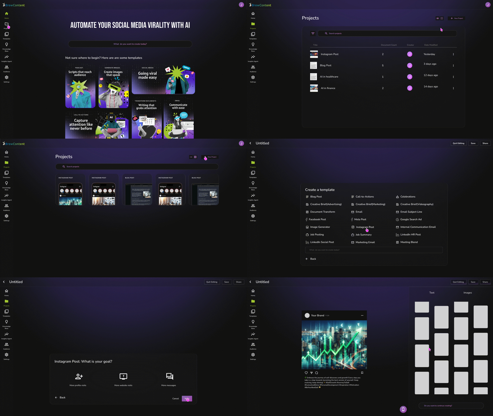
Without existing user research, design was driven by product and business KPIs for activation, retention, and platform engagement.
Because BrewContent evolved from an internal marketing tool into a consumer-facing product, there was no existing base of user research to build from. Design direction was driven instead by product and business KPIs tied to activation, retention, and platform engagement, with each flow designed against a specific metric it needed to move. Working in Agile sprints with product managers and engineers, I took solutions from low- to high-fidelity wireframes and used interactive prototypes to pressure-test navigation and information architecture before handoff. A key principle carried over from the platform's marketing-tool roots was that output should never feel generic, so every flow preserved the user's sense of identity and creative ownership even as generation became faster and more automated. This iterative loop simplified multi-step flows and contributed to a 40% reduction in clicks across core tasks like content generation and export.
To support this pace across desktop and iOS, I built and maintained a scalable Figma design system using variables, Auto Layout, and reusable components, so consistency and accessibility held up as flows were restructured sprint over sprint. The result was a process shaped less by discovery research and more by rapid, metric-informed iteration: define the KPI, prototype toward it, validate through cross-functional review, and refine based on post-launch data.
.png)
Wireframing
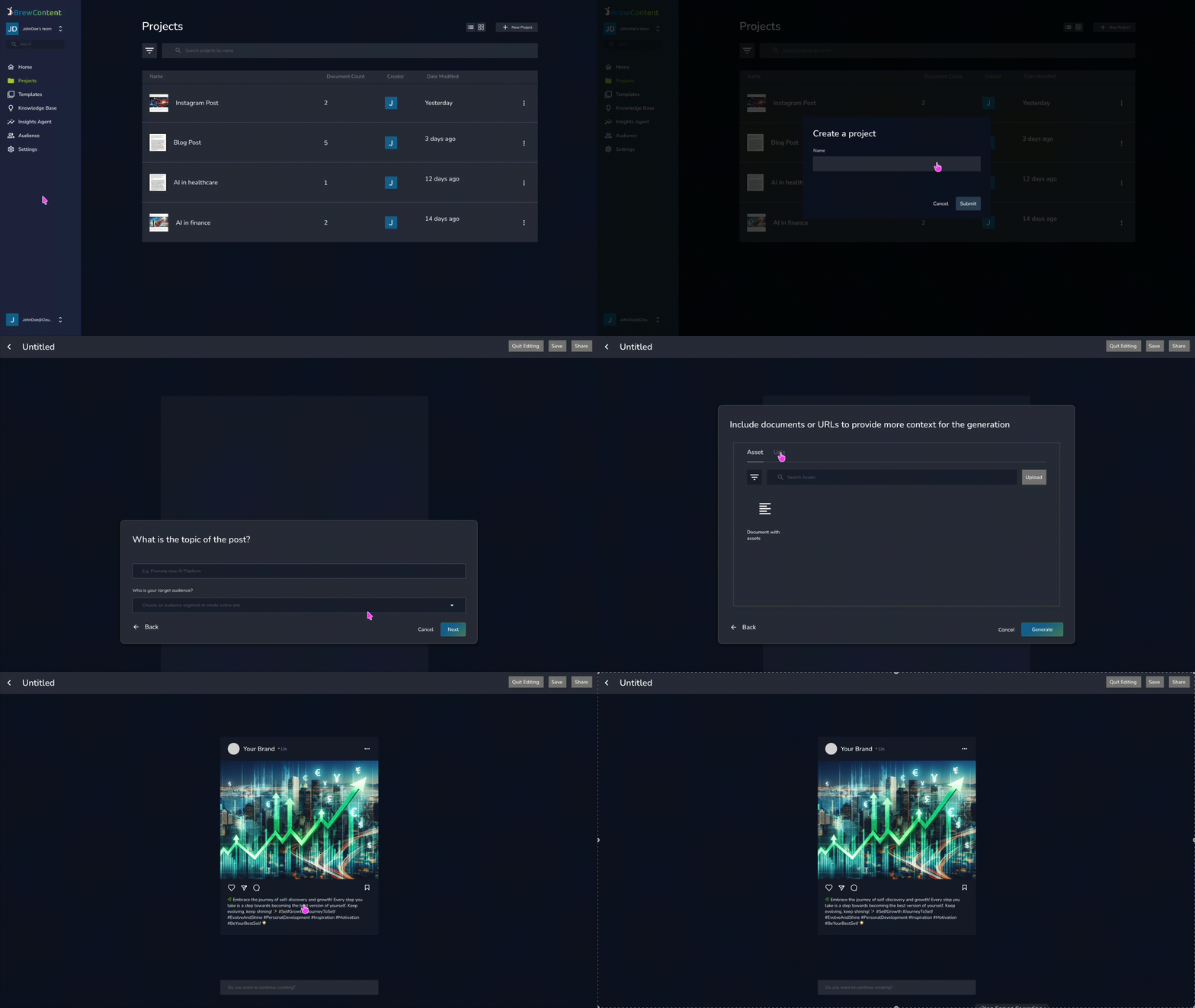
Before any visual design decisions were made, each core flow was mapped into low-fidelity wireframes
Before any visual design decisions were made, each core flow (content generation, version review, audience profile setup, and preview) was mapped out in low-fidelity wireframes. This step was critical given the KPI-driven nature of the project. Without user research to validate assumptions, wireframes served as the primary tool for testing whether a flow's structure could move on to high-fidelity design. Wireframes went through several iterations in Agile sprints, reviewed with product managers and engineers to catch structural issues early.
Final Design
The final design were focused on solving for these KPIs
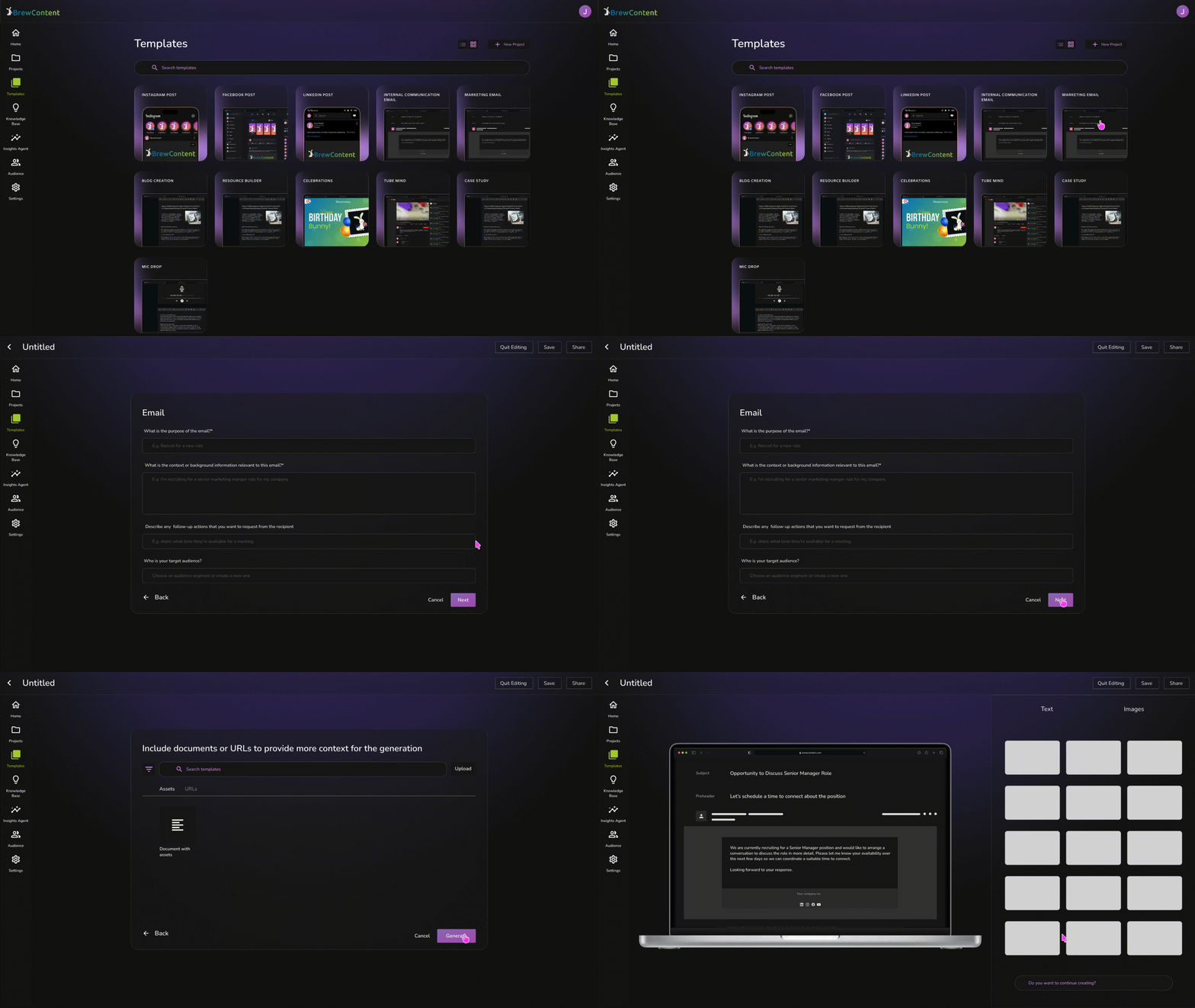
Getting Creators to Their First Export, Faster
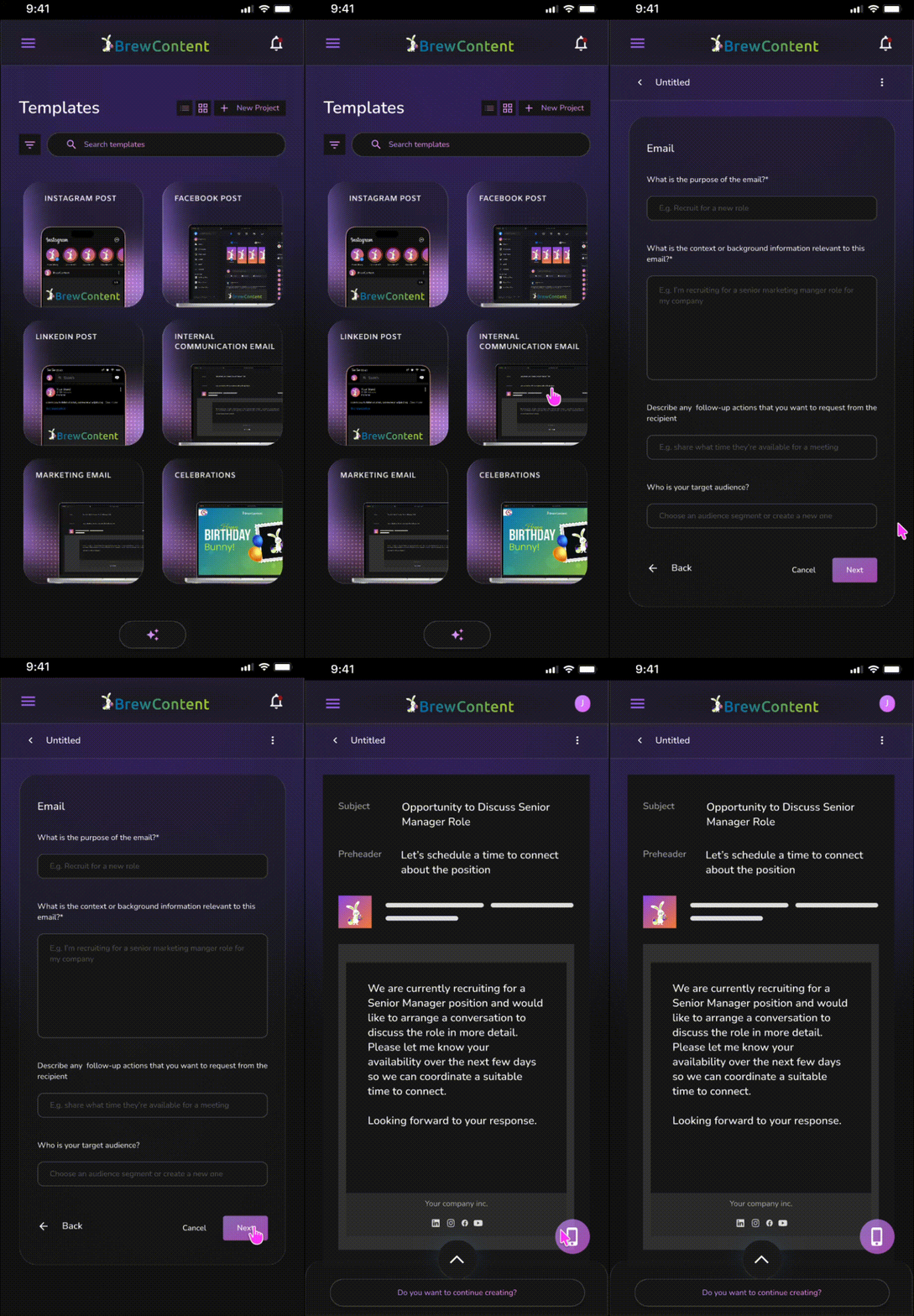
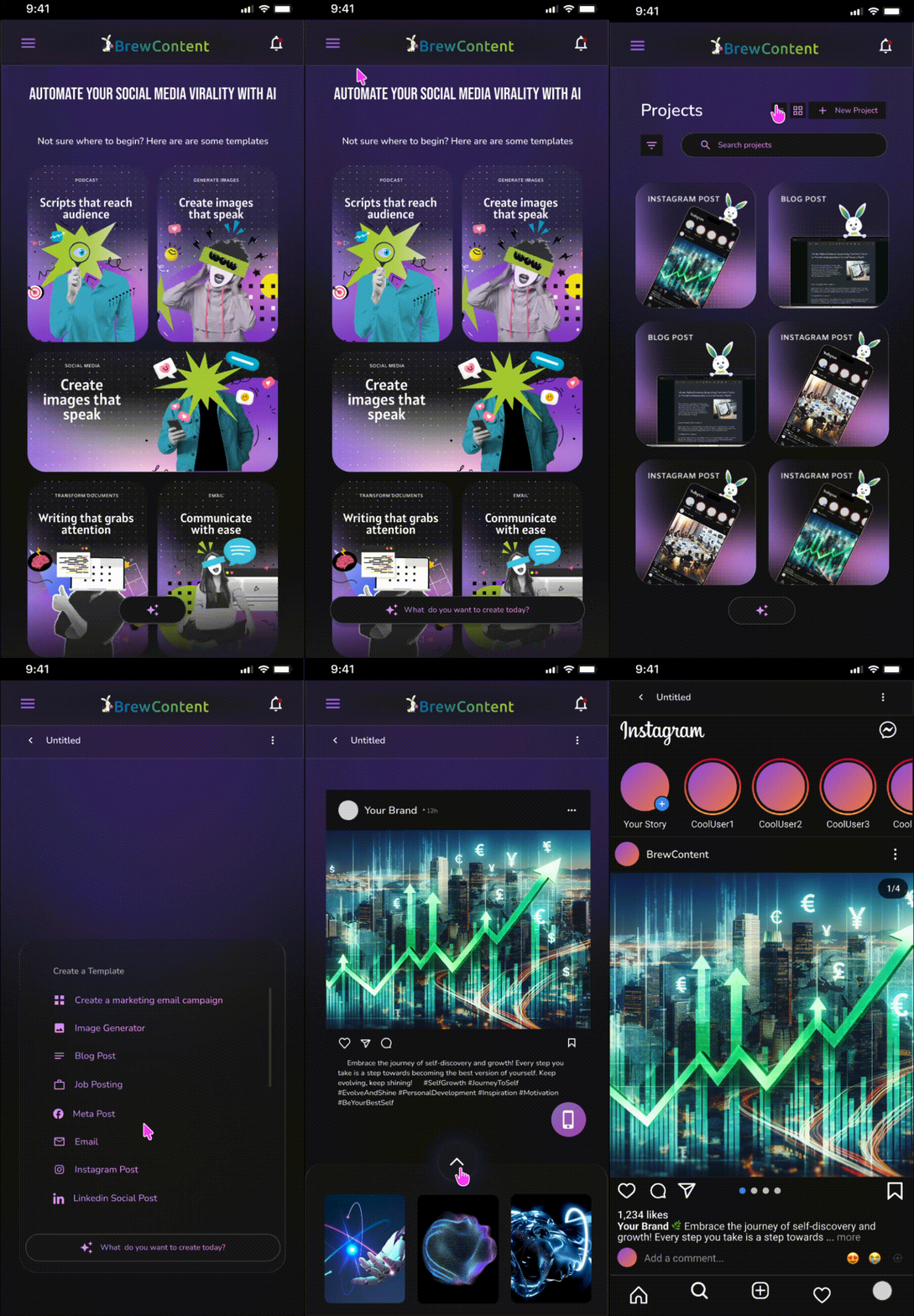
The initial flow required creators to navigate through multiple disconnected steps before generating usable content. To reduce time-to-first-export, the core creation flow was restructured around a single, linear path, from prompt to generated output. Removing redundant navigation and decision points along the way.
Since audience profile data directly determines content quality, the setup flow was designed to be guided and low-friction rather than a lengthy form. This reduces the chance that a creator abandons setup before ever generating content.
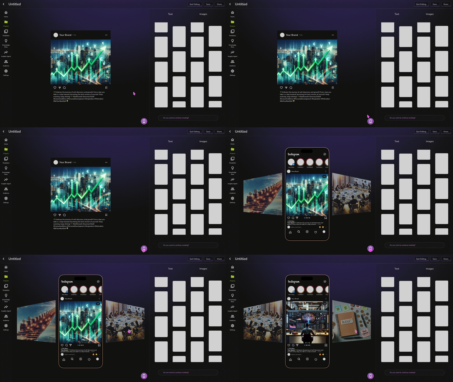
Designing for Exploration: Version History as a Creative Safety Net
Since content generation is exploratory by nature, the design needed to eliminate the fear of losing a good version while trying something new. The version history view lets creators see and compare all previous iterations alongside their current one, encouraging experimentation.
AI-generated content carries an inherent trust gap. Creators need to know exactly how something will look before committing to it. The preview screen renders content as it will actually appear once posted, closing the loop between generation and publishing.
One Design System, Two Platforms, Zero Compromises
To protect task-completion parity across desktop and iOS, a scalable design system was built using Figma variables, Auto Layout, and reusable components, ensuring the same interaction patterns and visual language held up regardless of screen size or platform.
Wrapping up
Reflecting on the project
-
Designing without user research sharpens metric literacy, but it has limits. Working solely off product KPIs forced me to translate abstract business goals into concrete design decisions quickly. But it also meant flying blind on why users behaved a certain way. This project reinforced how much richer design decisions become when quantitative targets are paired with qualitative insight, and it's made me more intentional about advocating for even lightweight research (like quick usability tests) on future KPI-driven projects.
-
Owning a project end-to-end as a sole designer means constantly adapting. I moved between high-level IA decisions, sprint-level prototyping, and pixel-level system consistency almost daily, often without another designer to sanity-check direction. This taught me to build my own checkpoints, such as revisiting flows against the original KPI, stress-testing designs against edge cases myself.
-
A scalable design system is as much a communication tool as a production tool. Building the Figma system taught me that consistency across desktop and iOS gives engineers and PMs a shared reference point so cross-platform decisions could be made quickly, without every conversation starting from scratch.